I grabbed this screen to prove the point. The billing controls weren’t in the modal. They were hiding beneath it, off-frame, like buttons on a sunken UI layer. Cancellation opens via pop-ups through the payment owners: either Stripe or your X account page at X (formerly Twitter). If your browser blocks pop-ups, nothing tells you. No error. No warning. You just get a dead link and a billing loop that pretends to help you leave it.
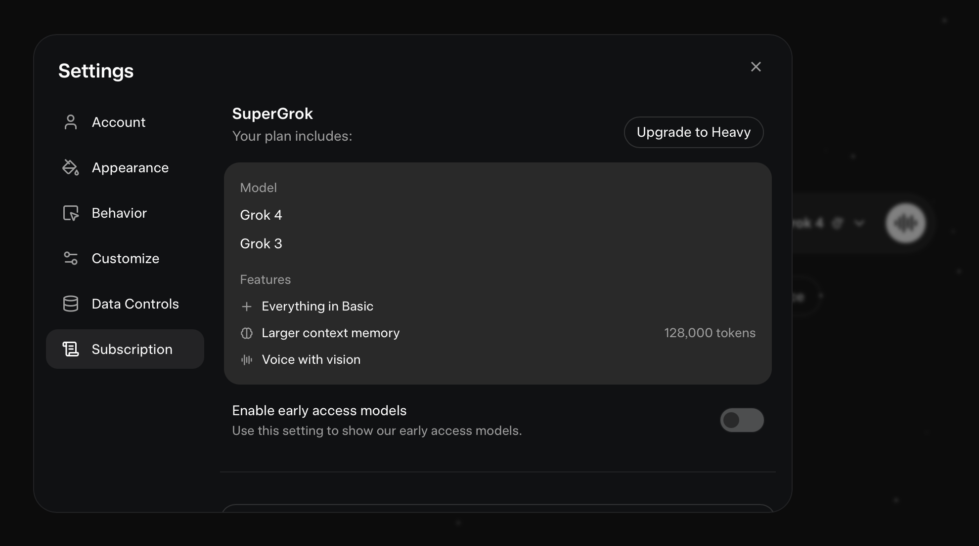
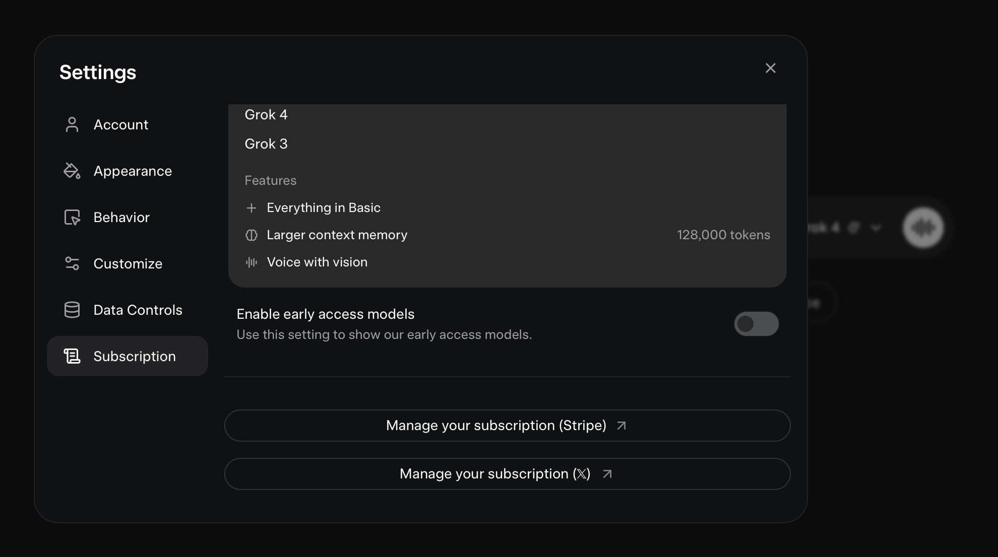
Image shows a dark-themed settings modal titled SuperGrok. The left sidebar inside the modal contains menu items: Account, Appearance, Behaviour, Customize, Data Controls, and a highlighted Subscription tab. The main panel displays the active plan including Grok 4 and Grok 3, plus added benefits such as larger context memory. The modal itself has no visible scroll bar or cancellation button, making subscription controls appear non-interactive. The underlying webpage behind the modal contains the actual billing management links, but these are off-screen unless the user scrolls the background. The interface relies on pop-ups from billing owners such as Stripe or X (formerly Twitter) for cancellation. The lower portion of the screen shows a toggle for "Enable early access models" and explanatory text, reinforcing the decoy nature of the modal.
How to actually cancel SuperGrok
- Open Manage your Grok subscription
- Scroll the page behind the modal
- Select one of the billing owners:
- Cancel via X
- Cancel via Stripe
- If nothing happens, go to browser settings → Pop-ups & redirects, allow them for the billing owner
- Retry and confirm cancellation in the pop-up
That’s the cancel process. It works, but it works only if you notice what you’re not meant to notice.
UX critique: why it feels malicious
X’s subscription UI makes entry frictionless, loud, and styled. Exit is a modal signpost, not a portal. The real controls live outside the frame and fire as pop-ups. No designer delivers this unless the brief was simple:
“Make subscribing easy. Make unsubscribing hard. And don’t tell them if it fails.”
No designer would make this flow if usability was the priority. Not one. If this wasn’t deliberate dark-pattern design, it resulted in it anyway.
What makes it feel intentional isn’t complexity. It’s the silence. The loop. The invisible failure states. The confidence that you’re the error.
You weren’t.
You were the QA.
